Example: Frequency of climatic condition in the Psychrometric chart of New York, USA
Example: Frequency of climatic condition in the Psychrometric chart of New York, USA
Example: Psychrometric chart with climatic conditions of New York, USA

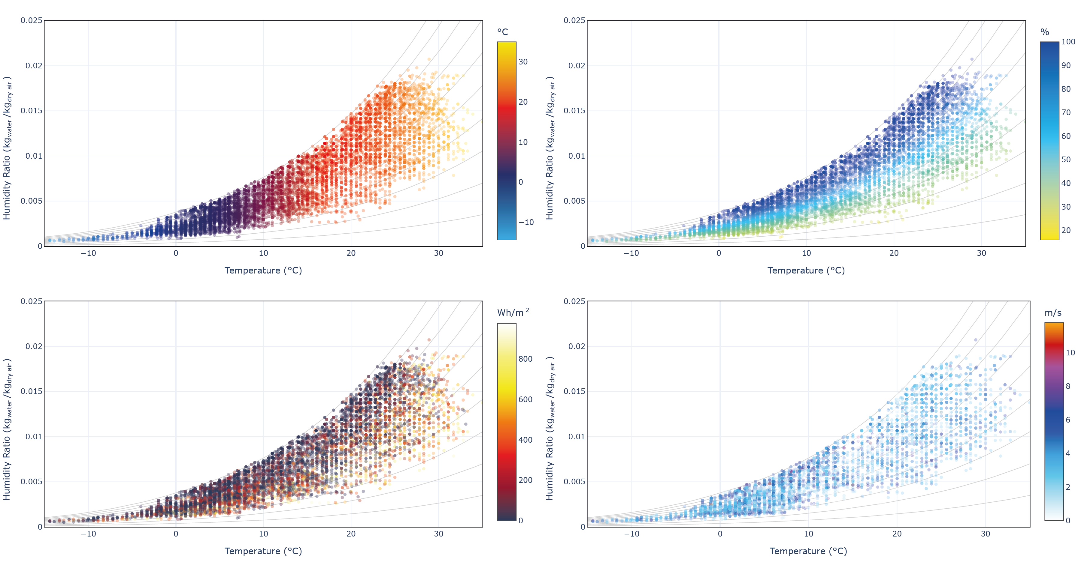
Example: Psychrometric charts with different variables (from top left to bottom right): dry bulb temperature, relative humidity, global horizontal radiation, and wind speed

Psychrometric charts filters